
Proximity
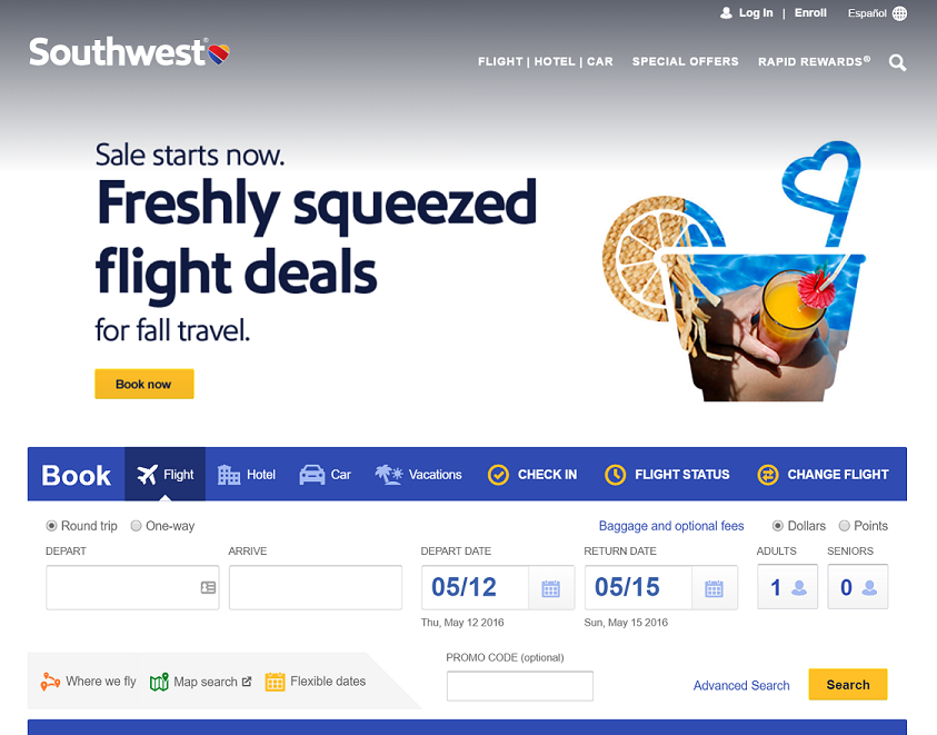
This sight demonstrates proximity by grouping the login and enroll links at the top. It also groups common links in the header on each page (Flight | Hotel | Car). It uses the space below the header to feature promotions. This breaks the page up and helps with the overall flow of the site.
The blue "Book" bar contains links to the most common used pages to book new travel components or manage existing ones. Below the blue bar, all of the elements needed to book a flight are grouped in a logical sequence from left to right.
The sight also uses the blue bar above and below the search elements to help keep the grouping together. Notice also how in the lower left of the search elements group, there are links to other resources. This helps the sight to be efficient but not feel cluttered.
Example of proximity websiteAlignment
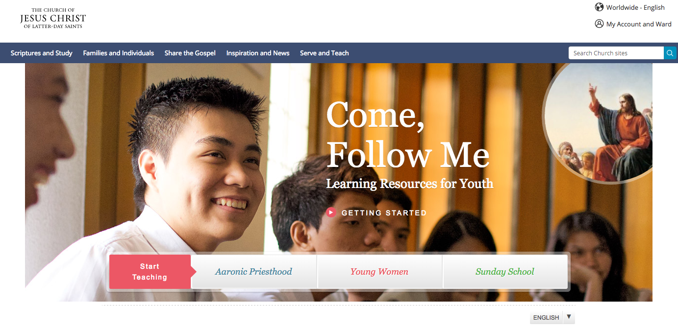
The site Come, Follow Me does a great job using the figure D as the layout for the home page. Following the structure of the figure D, we can see that the church logo is at the top left header, followed by the navigation bar horizontally, with the banner image just below the navigation bar.
Another excellent point about the way the site is using the alignment is the orientation of the pictures that we see, the young men are looking inwards making the text a center of focus, it also has the picture of Jesus pointing inwards. The purpose of alignment is to help the text flow with the images, if the two pictures were looking outwards your eyes would keep going to the edges of the page.
Example of Alignment websiteRepetition
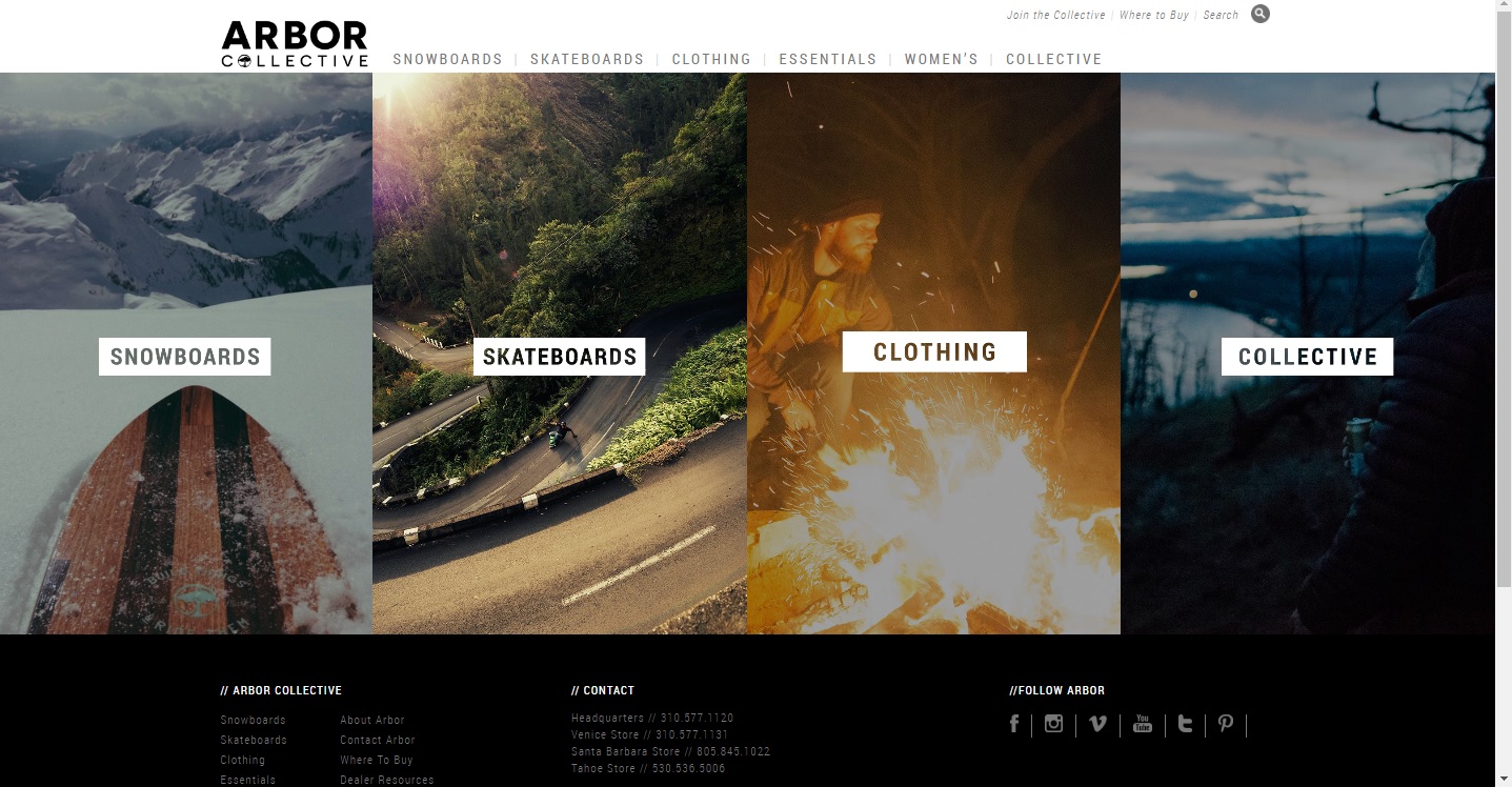
The website that I chose to demonstrate repetition was Arbor Collective which is a website that sells skateboards and other board sport products. The reason I chose this site is because I really loved how the home page had a clear example of repetition by having several images across the screen all the same size. This to me made me look at each individual image and look to see what was different, they obviously were each links to different parts of the website. Each image was the same size and shape which brought unity to the page, but also this helps the user to identify what is unique about each image as well. Then when we click on the links that lead us to the secondary pages of this site, we will notice that each sub-page has an image that is the same size and shape as the combined four images on the homepage. This really brings together unity across all of the main pages of the site.
Example of repetition websiteContrast
The first thing you can see about this web site are the color choice that the designer has made. Some of the colors contrast each other. For example, the red on the bottom is a contrasting color with the green high up because they are on opposite ends of the color wheel.
If you look at the menu bar you can see which section is being clicked because of the contrast. It has a dark color that stands out from the white background and then it also makes the text inside white so it is easily read.
When you look at this web page you can clearly see the color contrast, but what you don't think of is the contrast in size of each box. The bigger in size that it is, the more that it calls for your attention to it. The menu at the top of the page is smaller than the boxes for content on the page. This means that they are not as noticeable on purpose. The designer wants you to notice the menu, but focus your attention on the content and that is why they created the contrast in size.
Example of Contrast websiteTypography
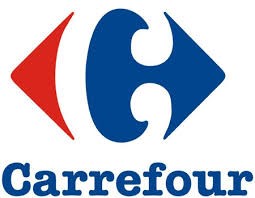
Carrefour is a French brand. The word in French means “crossroads”. The two arrows point to opposite side showing that it is possible to find a large variety of products in their store. They have also the colors of the French flag. The most attractive thing is that the white space between the two arrows creates a “C”.
Team Members
- Proximity - Stan Anderson
- Alignment - Jose Covarrubias Luna
- Repetition - Anker Peet
- Contrast - Chari Clark
- Typography - Sara Teixeira Figueiredo